SERVICESBusiness Intelligence & Analytics
Visualization and Dashboards
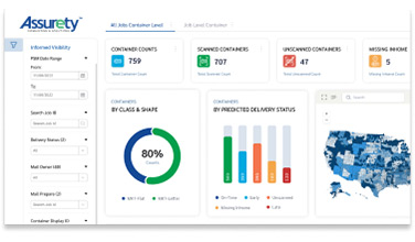
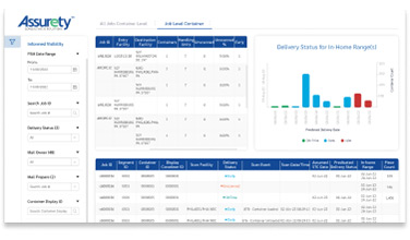
Nobody enjoys looking at a gray page of numbers, but most importantly, those rows and columns can’t tell a story the way a colorful chart or graph can. And, plain spreadsheets aren’t conducive to collaboration the way interactive dashboards are.
Assurety excels at storytelling through data, with real-time visual representations of the most important metrics to your organization. Our team develops the tools that give executives and mid-level management the power to make informed, proactive decisions by presenting complex data in an easy-to-understand format.
Assurety can make your data come alive and paint a clear picture of your operations with easy-to-follow visualizations and comprehensive dashboards. You don’t have to be a mathematician or data scientist to understand and manipulate your data as presented by Assurety. Our intuitive tools help users identify trends, patterns and outliers in data sets so management can react quickly to challenges and replicate successes.
Collaborative decision-making is the key to maintaining your competitive edge. Assurety’s visualizations and dashboard views present data in a meaningful way that facilitates communication among staff and management. Easily share data across the enterprise that can be quickly digested by your whole team, whether they’re in IT, accounting, production or the executive suite.
During the design phase, our experts will engage with key staff to make your visuals meaningful and stand out. The scalable, dynamic data tools Assurety develops for your organization will provide the real-time monitoring of critical business metrics that take the guesswork, gut-feelings and subjective opinions out of decision-making.
Does your organization have data in multiple formats or several different computing systems that you’d like to display in one central dashboard view? Assurety can help. We have extensive experience in data integration and have helped multiple clients centralize their critical operational data into a single unified view.

ERP System Development Accounting-Billing
Problem Statement: South West Distribution, the largest distributor for The Washington Post, teamed up with Assurety to reimagine their accounting system. South West was plagued with a legacy accounting system that had too many incomplete workflows, manual processes, and reporting issues for both accounts receivable and accounts payable. That strained the accounting staff and slowed reporting.
How we have helped our customers

Financial Decision Support across Verticals
Problem Statement: Emory University School of Medicine had difficulty with transparency and reporting due to siloed modules in their ERP. They sought a solution that combined data from all sources into one system that could be used by all departments.

RFID based Inventory management for a Sports Retail Chain
Problem Statement: A sports equipment retailer experienced high costs and lack of control associated with manual inventory management. And, fraud was difficult to detect in real time, leading to shrinkage issues. The retailer’s consultant, Business Builders International, partnered with Assurety to create a more efficient, automated inventory management system.
Credit Card Platform Integration – eCommerce Implementation
Problem Statement: USPS sought to switch banking vendors for online credit card transactions accepted through their eCommerce site, Welcome | USPS . With regulatory and internal security rules changes, the new system needed to be more secure and have a separate architecture. Their bank wanted to develop a risk-based fraud detection technology platform that could predict and identify fraudulent credit card transactions.
Customer Testimonials

“ I loved the clean user interfaces, and browser-based programs that are a step above everything we’ve seen before. It makes it easy to use for other people in-house here. ”
Prescott Marston – Data Technician

“ Assurety has the rare combination of a proven record, a good ear to customer needs and a keen eye to the future. I trust its ability to develop great products and service. ”
Todd Black – Director

“ [Assurety’s software] is doing everything we need it to. It has all the tools we need and it’s easy to use. ”
Alex Miller – Mailing Specialist


